HEARST NEWSPAPERS / PRODUCT DESIGN / UX / UI
Newsletter Sign Up Hub
I was given the task of building a multi-newsletter sign up page as part of continued efforts to drive engagement. The goal was to have 1 hub where users may check and change their newsletter preferences, while also giving the newsrooms the ability to highlight new or topically relevant newsletters to increase user engagement and subscriber retention.
.png)
Step 1
I began this project doing a competitive analysis of other post-checkout user flows in media. I went through and stickered each example to highlight the highs and lows of each of the pages to get an idea of what works and what get's lost.

Step 2
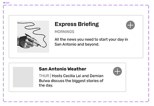
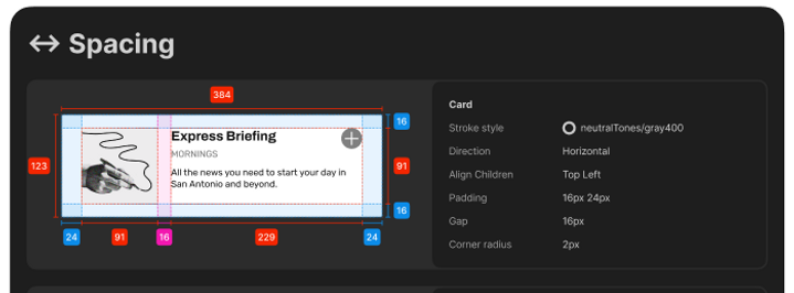
Taking these findings and bringing them to stakeholders, we came away with the understanding that major changes to the UX flow itself was not currently possible, but that the main goal of this design should be to package the newsletters in an engaging and appealing way. We would like this page to feel lux for our paying subscribers, and show the value of a subscription to site visitors. With that in mind, I revisited our design system and began re-tooling an existing card in our system to apply it to this framework.
Step 3
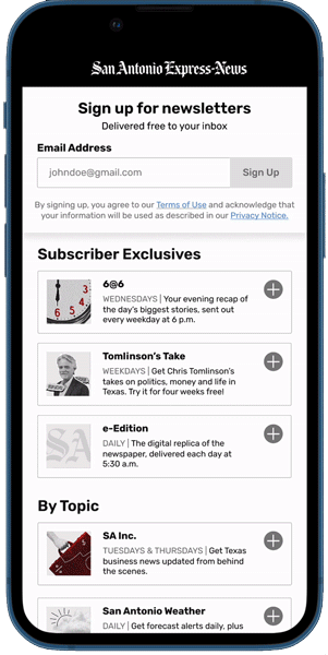
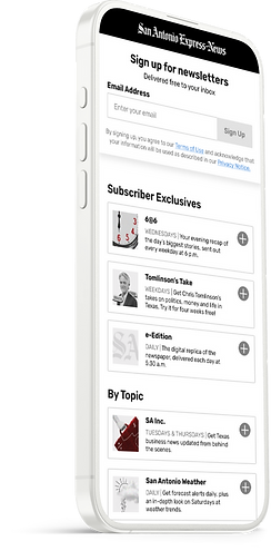
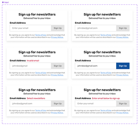
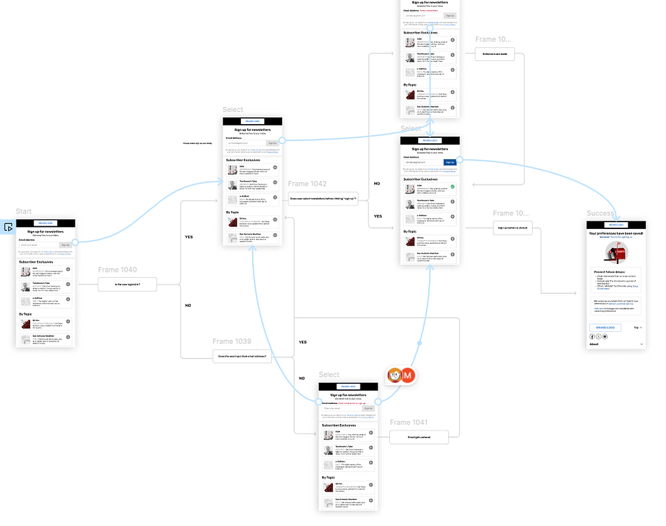
I began to construct the page on mobile first, adding in the option for newsroom to group newsletters together under a common theme, author, or even "Subscriber Exclusive" newsletters to push the value of a subscription. From there, I laid out the UX flow and began finding opportunities for user error and brainstorming ways to keep users on track.
Step 4
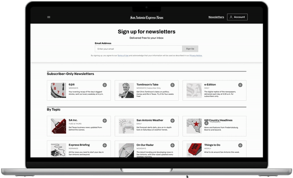
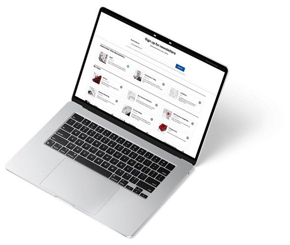
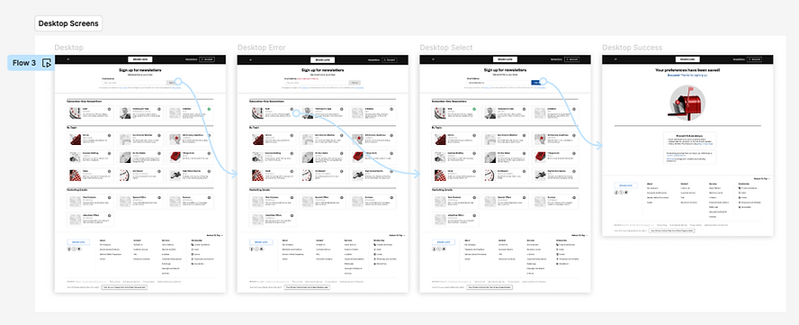
Once the mobile design and flow were approved, I began the work of translating that to desktop and deciding the rules for the grid. Testing was done on screens of multiple sizes, including mobile, laptop, tablet, and desktop monitor.
Done!